Turned abstract mutual-fund SIPs into named life goals for
Navi's investing app, giving people a reason to start and a
reason to stay; daily SIP starts rose 20%.
Project UI · placeholder
03 / About
Off duty, AirPods in.
About
Your friendly neighborhood designer with a side quest in fitness
and games. I do product design at Presentations.ai, after stints
at Disney+ Hotstar and Navi. Storyteller first, pixels second; I
like making complex products feel obvious, and I do it with a
smile.
Social betting on fitness goals. One dashboard pulls every app,
every equipment stat and the Apple Watch into one place; a
WhatsApp bot posts to the friends group and messages each
person their remaining targets for the day, food included.
All apps + Apple Watch, one dashboard
WhatsApp group + personal nudges
Money on the line, goals get met
Coming soon
Design.md file generator
Built
Point it at any URL and get a clean Markdown file back:
headings, copy and structure preserved, clutter stripped.
Made for feeding the web into notes and LLMs.
Case study · Redesigning an AI-first tool, from scratch
Redesigning Presentations.ai
The world's best AI presentation maker!
Role Product design
Where Presentations.ai
Shipped 24 Feb 2026
Scope Architecture, dashboard, invites
The world's most used business tool hasn't changed in decades. So we rebuilt ours from scratch.
The gap we exist to close
Presentations are the language of business, yet the software used to make them hasn't fundamentally changed since the 1990s. PowerPoint and Google Slides digitised paper presentations. They never transformed how we create them.
Presentations.ai exists to close the gap between a raw idea and a finished, professional deck. Not eventually. Not after hours of manual work. Right now. Instantly.
The product was holding itself back
There was no shortage of ideas for where the product could go. The existing architecture made most of them impossible to ship. New markets, core features, industry standards; none of it could happen on top of what existed. So we set out to recreate the foundation: scalable, backend driven, and a significantly better experience to use.
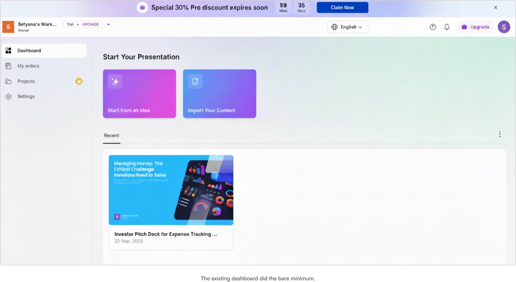
The old dashboard did the bare minimum.
This case study is thin on metrics. The product was too broken for data to lead; we went back to first principles.
The company's event tracking and funnels could not give granular insights yet. So this is about the thinking, the decisions, and the work. Numbers will come as the product matures. If you want to see how I work with data, read the Hotstar case study.
ExperienceCore flows rethought, navigation simplified, key actions surfaced. Brought up to the standard users expect from modern tools.
Look and feelA refreshed visual language and a component system that reflects the intelligence behind the product.
The table stakes were missing
The foundation every enterprise tool is built on was missing from ours. We benchmarked the basics.
File management
Presentations.ai
Gamma
Notion
Workspaces
Yes
Yes
Yes
Nested folders
No
Yes
Yes
Drafts
No
Yes
Yes
Shared with me
No
Yes
Yes
Private folders
No
No
Yes
Collaboration
Presentations.ai
Figma
Notion
File-level sharing
No
Yes
Yes
Role-based permissions (view, edit, admin)
No
Yes
Yes
Invite via link or email
No
Yes
Yes
Folder-level access control
No
Yes
Yes
Guest access (external collaborators)
No
Yes
Yes
Every presentation lived in one endless pile
No folders, no nesting, no grouping. Every deck sat in the same flat list regardless of project, client, or team. There was no way to organise, sort, or find your work efficiently. The product punished its most active users.
Status quo · one pile
The target · organised
Clients
Internal
Archive
Status quo: one pile, no structure, no way to find what you need. The target: organised, labelled, built to scale.
Built for solo use; work isn't
Nobody makes a presentation just for themselves. It gets shared, reviewed, edited, handed off. The product assumed a single user working alone. Real work doesn't look like that.
Before · solo by design
After · built for teams
Status quo: one person, one document, everyone else locked out. The target: the same work, open to everyone who needs it.
We audited six products across five categories
Every pattern worth knowing, mapped before a single screen was designed.
6Tools audited
5Categories
17Criteria compared
80%Live at ship
YesNoPartialNot checked
1Organisation
The pattern
Most tools separate personal and team spaces with clear boundaries. Private areas, shared areas and team areas exist as distinct containers.
What we took
Personal content stays personal, workspace content is visible to the team, and shared items get a dedicated view.
Drive
Dropbox
Notion
Canva
Pitch
Figma
Private area
Team area
Shared area
Multiple teamspaces
Team org threshold
2Locations and permissions
The pattern
The best tools tightly couple location and permissions; where a file lives determines who can access it.
What we took
Moving a file between personal and workspace changes its visibility. Folder-level permissions cascade down, keeping the mental model simple.
Drive
Dropbox
Notion
Canva
Pitch
Figma
Folder permission levels
Location-permission coupling
Location sets default permissions
3Nesting and inheritance
The pattern
Most tools support nested folders with inherited permissions.
What we took
A flat folder structure with no nesting, to keep things simple. Presentations inherit the visibility of their parent folder; workspace folders can be public or private.
Drive
Dropbox
Notion
Canva
Pitch
Figma
Nested subfolders
Can restrict children
Can expand for children
4Sharing and visibility
The pattern
The industry is split between combined and separate systems for links versus direct invites.
What we took
We kept them separate. Workspace invites for internal collaboration, external links for clients and stakeholders. Private items never surface in workspace search.
Drive
Dropbox
Notion
Canva
Pitch
Figma
Private items appear in search?
Link vs direct invites
5Guest and external access
The pattern
Most tools support guest access at the file and folder level, with domain restrictions.
What we took
Guests are scoped to individual presentations only; they collaborate on specific decks without gaining workspace visibility.
Drive
Dropbox
Notion
Canva
Pitch
Figma
Guest access: files & folders
Domain restrictions
Password-protect links?
Link expiration?
The new file architecture
Everything splits into two spaces: personal and team. Personal space is a simple filtered view of your work; no folders, no hierarchy. Team space is structured; every file sits in a folder, public or private. Permissions follow location. New and uncategorised files rest in drafts until they move to a project.
Team spaceEvery file lives in a folder. Permissions follow location.
MarketingPublic
Launch planBrand deck
SalesPublic
PipelineMcKinsey bid
ExecutivePrivate
Board packComp review
Draftsuncategorised files wait here until they move to a project
The new architecture: personal stays flat, team stays foldered.
1All personal content is private by default
2Personal space has no folder structure
3Content shared with you lives in Shared with me
4No nested folders anywhere in the system
5Team folders default to public visibility
6File permissions always inherit from the parent folder
The dashboard
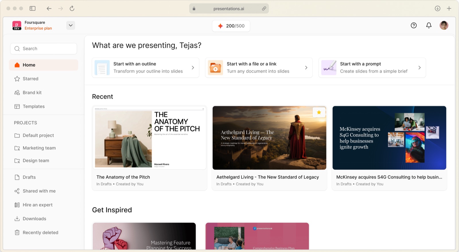
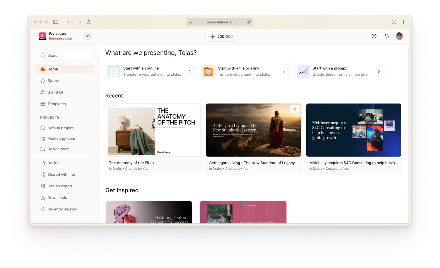
Everything starts here. Create, find, organise and collaborate from one screen.
Plan visibility at a glance so users always know what they're on
Credits always visible so users know where they stand
Profile and workspace settings separated for clarity
Global search always within reach
Entry points that guide you straight into the create flow
Relevant features surfaced where you need them, not buried in menus
Visual cues that split public folders from private ones
Larger thumbnails so you spot your work without reading titles
Shared with me as a dedicated space
Metadata on every file: where it lives and who made it
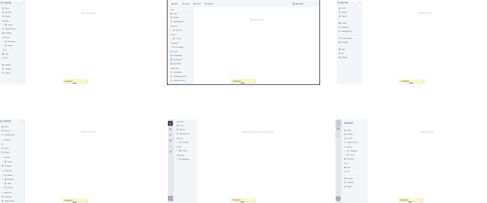
A pile of layouts was vibe coded and tested before the final dashboard won.
Rethinking invites
Sharing isn't one action; it's three. Workspace level, project level, file level. Each behaves differently depending on plan, role, and whether you're an admin. A free user inviting a teammate sees a different flow than a team admin with open seats. A file in a public project follows different rules than a file in drafts. We mapped every combination across four plan types, multiple permission roles and file locations, then designed flows that absorb the complexity instead of exposing it. For the complete invite logic across plans, roles and edge cases, read the full share-flow documentation.
Permissions inherit downwards
01 · Workspace
An invite needs a seat. An admin approves. Full access follows.
02 · Project
Public projects open to every member. Private projects need an explicit invite.
03 · File
Share as a member (needs a seat) or as a guest (no seat, this deck only). Rules adapt to where the file lives.
Permissions inherit downwards: workspace into projects, projects into files.
1Workspace invites require available seats
2Non-admins can invite; an admin approves
3Public projects open to every workspace member
4Private projects require explicit invites
5File sharing adapts to where the file lives
6Guests get instant access; full seats need admin approval
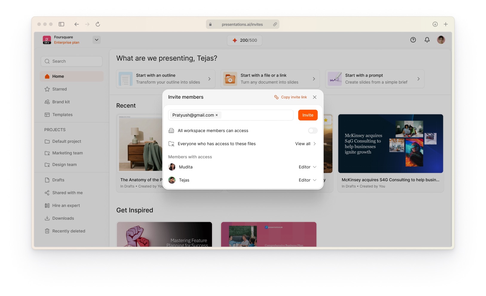
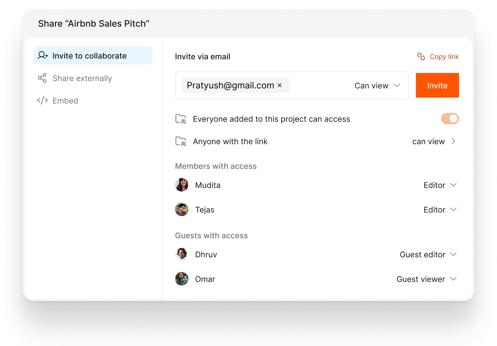
Invite, share, control. All from one place.
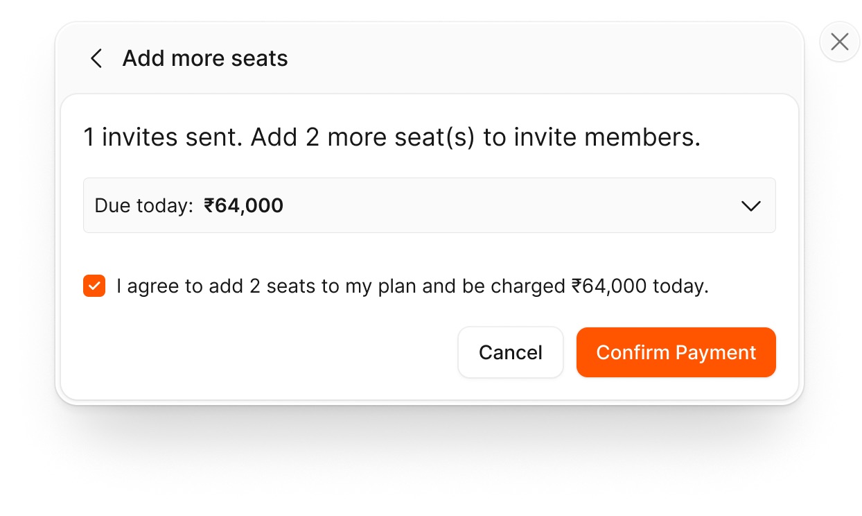
Member or guest, with the right permission level, set before the invite is sent.Out of seats? The upgrade happens in place, not in a settings maze.
Link sharing got the same treatment:
Copy a link with permissions baked in; the link changes with the access level
Toggle permission and access for any guest or member
Control who can access via link, and what they can do, from one settings view
The redesign cleared the way. Now we build forward
The redesign touched every layer of the product. Architecture, dashboard, invite flows, permissions, file management; all rebuilt from the ground up. It shipped on 24 February 2026 with about 80 percent of the redesign live and the rest rolling out. Too early to talk numbers, but the bottleneck that held everything back is gone. New features are already being built on top of what didn't exist a few months ago.
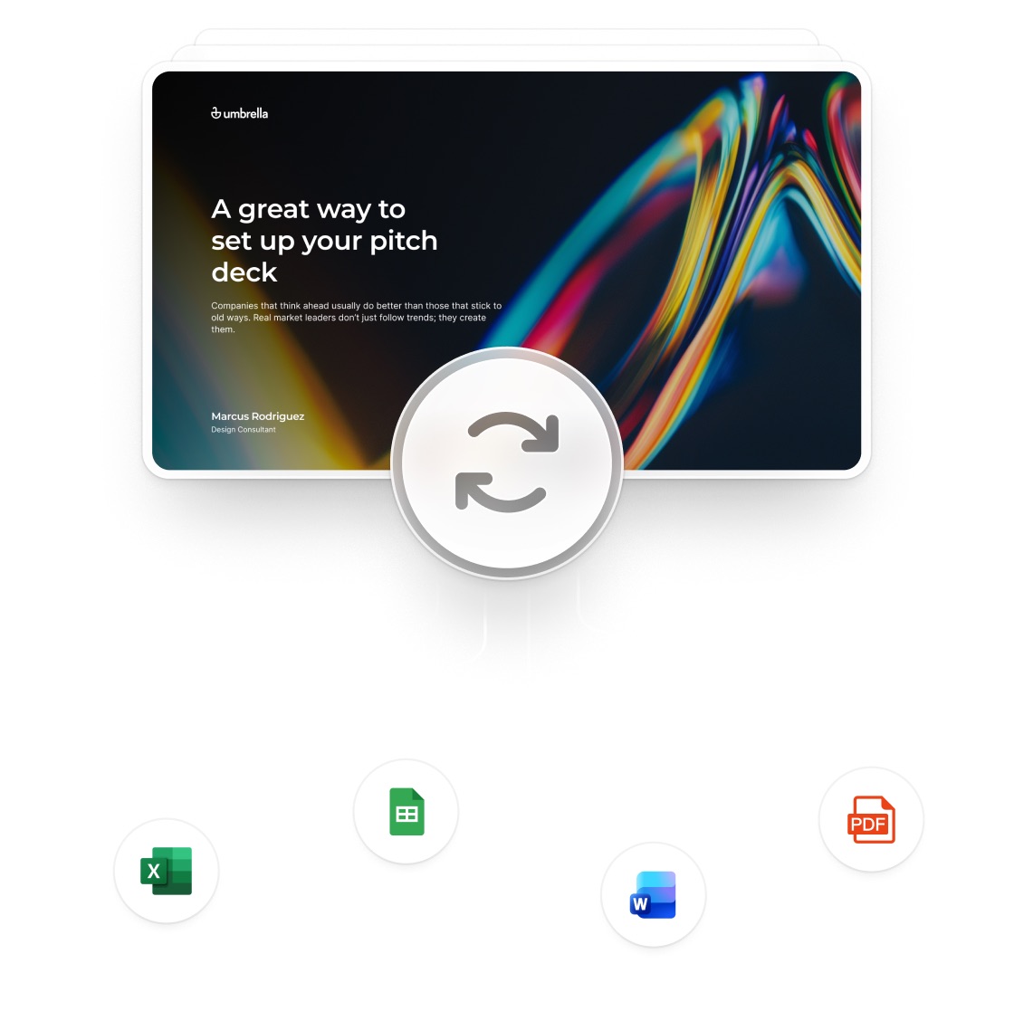
Next up: refresh a deck automatically when the data behind it changes.
Next up: refresh. Paste or upload your data and let the AI handle the rest, then review what changed on every slide. Keep what works, adjust what doesn't.
Right now my time goes into better slide generation. That means understanding the create flow at a deeper level: how slides are structured, what objects and nodes exist, how content gets generated. The model builds an outline first, then generates slides from it. I curate input datasets and fine tune each stage so the output is better by default. The bigger goal: slides that aren't bound by templates at all. Freeform, generated from scratch, every time.